top of page

Graphic Design
I have taken opportunities that help me further my skills and knowledge as a designer. I have extensive knowledge with Adobe Suite.
Exhibition Suite
Weems Gallery / Johnson Hall Rotunda
A suite designed for the Annual Juried Student Art Exhibition at Meredith College, Raleigh, NC. The images to the left are part of the exhibition suite from the previous year that I had for examples. The museum director wanted to go heavy with typography and accessibility. I chose a green color palette for the design because it is a color the eyes never tire of .


Logo Design
Child Advocacy Group
The Child Advocacy Group is a fictitious group I created for a school project. In creating a logo for them I chose for it to resemble that of the paper doll chains you made as a kid. I also wanted to represent a bridge to symbolize children crossing from childhood to adulthood safely. I accomplished this by joining the hands to symbolize a bridge. Because I imagined it as a not- for- profit organization, I chose a black & white color scheme that would ensure low printing cost. I chose a traditional serif font that would represent both a strong, dependable organization, as well as a sense of approachability which is needed when it comes to children and issues they face.
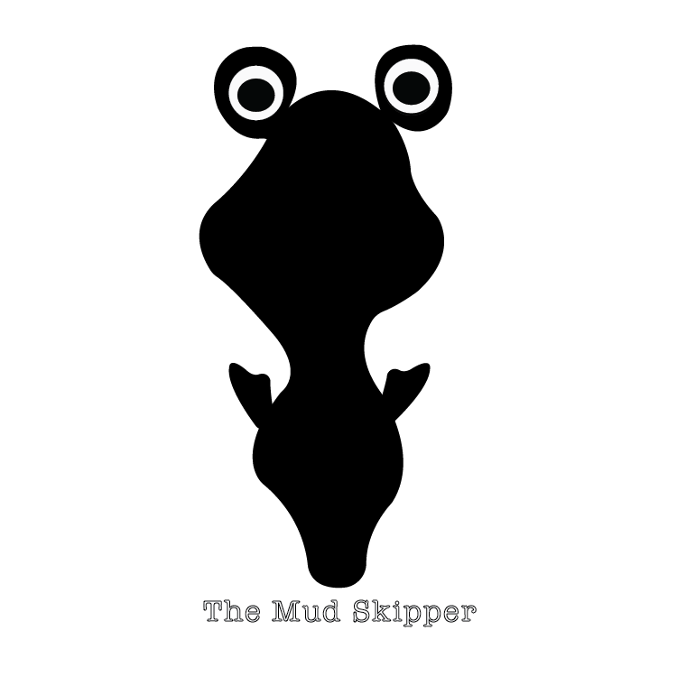
The Mud Skipper
The Mud Skipper is an illustrated creation of my daughter
Eva. She wanted the mud-skipper image to be her logo so I
converted the outline into a silhouette added the eyes (which blink. I chose a classic open face font that could easily be transformed for different publication and marketing needs.
Netta's Pantry
Netta’s Pantry is an in season catering service that provides personal meal prep ideas from your pantry with a Farm to Fork Catering concept in mind. The organic flow of “Netta’s” lends to this concept. For the word pantry I used a font that complements the organic flow, but also lends itself to a ridgity like a fork which also gives stability. Both typography’s speak to the businesses character as well, one of flexibility in service but also a dependability in the service you will get.


Golden Brew
A modular logo that is suitable for both business and advertisement needs. This logo was based on the owners love of the movie “The Outsiders” specifically where Johnny tells Ponyboy to ‘stay golden’. I chose an organic feel for the word “golden” as if it was poured out. For “brew” I wanted it to have a strong yet frothy presence like coffee, so I chose the color black and papyrus for a classic look and broken feel to the letters like steam or foam.
Business Suite


Fiber Arts Business Model
For this concept we had to create a suite for a fictious company. My company was Jacobean, a fiber arts company offering equipment sales, product sales, and classes. I created the variations of logo for a cohesive yet practical use of the logo. The optional colors were to recognize that the company may need to use other colors for eventsthat it may host.
Advertisments


Intelligent Design
These are magazine advertisements for the fictitious Jacquard brand. These were designed to elevate the everyday craft of fiber arts to the intellectual. Having worked in the field of fiber arts I found more women than men undervalue fiber arts so I chose women as my subjects. The purpose in the quilt for hair was to show a relationship between an intelligently designed and constructed element and the mind. The photographs have these women looking slightly up to show pride in what they have accomplished. The quilt in relationship to the head also shows an elevated status of fiber arts as might a crown for a Queen. Although the quilt images are not the highest resolution, I still included this to show my design creativity. It is difficult to get high resolution photographs of quilts.


Colton Review
The Colton Review is an in-house art and literary publication of Mredith College. I was a signed a section of the Colton Review to place and organize photos, design elements and titles that kept a visual harmony and consistency with the rest of the publication.
Click to see enlarge
Brochure
American Dance Festival
A mock-up of the American Dance Festival Brochure. We were given the photos and text to create a brochure that spoke to what the ADF was all about. The color scheme matched their website at the time this was created.
Website Design
These were created in photoshop. I do know a little HTML and Java but would need more experience to be proficient.


Architecture
Using a real company’s photography and information we were instructed in class to create a new website design. My layout uses a feature slider of images on the homepage and a roll over effect for the company’s executives. When you roll-over an image you see it in color and a side menu pops up with information about the highlighted executive with a small image of them in the left corner, so you know you’re reading about the correct person. I used the font Abolition to give it the sofisticated modern look associated with the company
Magazine
The website was created from a ficticious fiber arts magazine created for an assignment. It's aim was to highlight all things related to fiber. The logo as well as the background is the same image in different colors which is also incorporated in the magazine. To stick with the theme of the logo I pulled used typeography to also enhance the pages and wanted this to show in the website as well. In hindsight I would have liked to have enhanced more on the use of typeography with the fibers like is seen in the magazine.
Campaigns
Advertisment Campaign

Printed Materials

To the left is the poster I created for the educations departments Social Canvas event. It's a fun packed day at the museum with food, music and art.Marian Hawk, Education Programs Manager at the Morris Museum of Art, wanted a poster that went with her theme "Let the Fun Times Fly". You will notice for the poster we linked it the the museum by adding "at..." and "...the". We chose not to do this on the coasters because of the positioning of the museum name, yet felt it still had the desired effect. The posters were design with the varias advertising space at local merchants. Poster sizes where 11" x !7", 8.5" x 11", and 4.25 " x 5.5".
I suggested the coaster idea for a marketing strategy at. resturants and other locations that serve drinks that support the arts. The idea behind this was that we might be more seen by their customers while also providing a helpful product that was not as much a nucence as having loose flyers or space occupying their windows.

01_Social_Canvas

02_Social_Canvas
07_Social_Canvas
01_Social_Canvas
1/7
The original campaign poster had to much information for a quick flip on Instagram. Instead I broke it down to a manageable series that worked great for the platform. Those who are interested in the details but want to get right to the point.
 |
|---|
 |
 |
Photography and Social Change
These posters where created for a photography and social change class. For this project the assignment was to use phtotos in a way to present the cause and a place for them to respond to the cause whether it was an inperson serve or online. I also had to create a website with information on pet overpopulation and spaying/neutering your pet using 50 photos (this was challenging). Also I created a survey to find out if peoples opinion of spaying/neutering their pet had changed after reading facts about the subject. The photos of the dogs where taken at the Wake County Animal Center. Spaying and Neutering Website
bottom of page